Palette Art

Mobile App design
Duration: 6 months, 2025
Introduction
Client / Palette Art (
Self-initiated)
Overview / As part of my Google UX Design Certificate, I created a self-initiated project: a sales platform for local artists. Drawing on my arts background and passion for printmaking, I set out to address real user needs uncovered through research.
Challenge / How might we help users easily discover art that fits their style while enabling artists to showcase and sell their work effectively?
Goal / Design a mobile app and responsive website that drives art sales, builds buyer trust, and strengthens the local art community.
Highlights /
Tools / Figma, Mural, Google Forms, PowerPoint
My role / UX Research, UI/UX Design, Branding & Visual Design
Overview / As part of my Google UX Design Certificate, I created a self-initiated project: a sales platform for local artists. Drawing on my arts background and passion for printmaking, I set out to address real user needs uncovered through research.
Challenge / How might we help users easily discover art that fits their style while enabling artists to showcase and sell their work effectively?
Goal / Design a mobile app and responsive website that drives art sales, builds buyer trust, and strengthens the local art community.
Highlights /
- Designed and prototyped a mobile sales app for local artists and buyers.
- Validated usability through two testing rounds — improving navigation and AR discoverability.
- Delivered an accessible, minimal visual system that keeps focus on the artwork.
Tools / Figma, Mural, Google Forms, PowerPoint
My role / UX Research, UI/UX Design, Branding & Visual Design
Explore the process →From insight to implementation
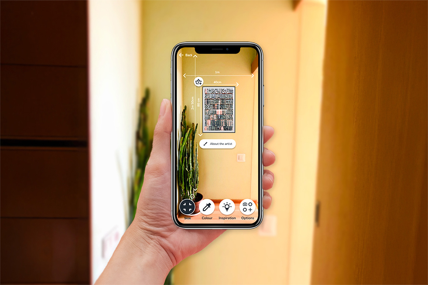
Fig 1. - Previewing artwork in a room (AR view).
DISCOVER
Research phase
Aim /
Understand the needs and challenges of art buyers and
artists to guide the app’s focus and validate whether it should prioritise sales or community-building.
Process /
Key findings /
Quotes from survey participants /
- “Their website is rubbish, but they’re good offline.”
- “Buying a more high-level art – customer service is critical”.
Key Insight / The app should prioritise driving art sales while supporting the community as a secondary feature.
Process /
- Conducted 2 online surveys (buyers: 9 responses + 1 interview; artists: 4 responses).
- Explored demographics, motivations, and purchasing/selling challenges.
- Captured qualitative insights through participant quotes.
Key findings /
- Buyers’ pain points - difficulty finding art to match style, uncertainty about quality, and high shipping costs.
- Artists’ pain point - difficulty reaching new customers and showcasing work online.
Quotes from survey participants /
- “Their website is rubbish, but they’re good offline.”
- “Buying a more high-level art – customer service is critical”.
Key Insight / The app should prioritise driving art sales while supporting the community as a secondary feature.
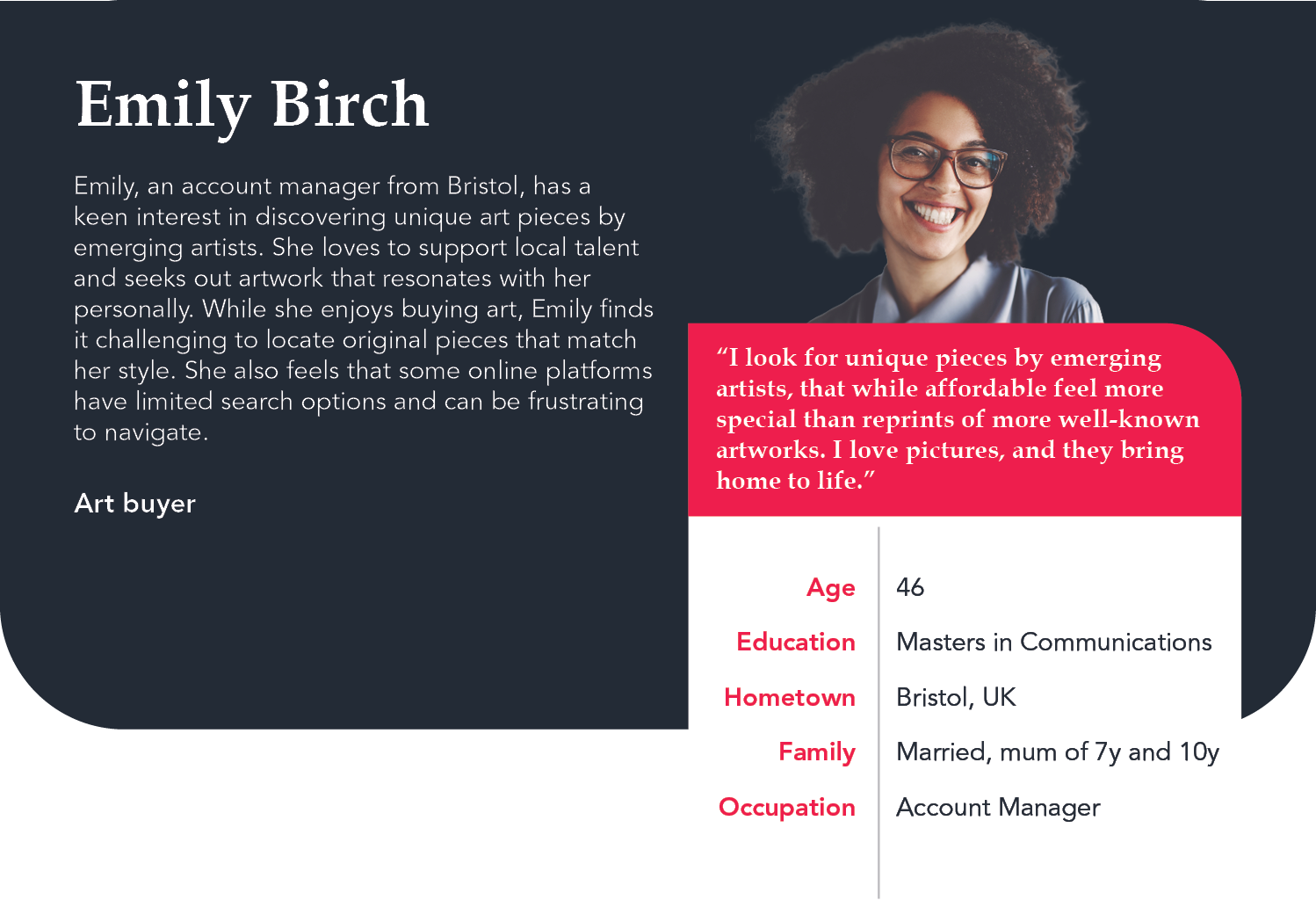
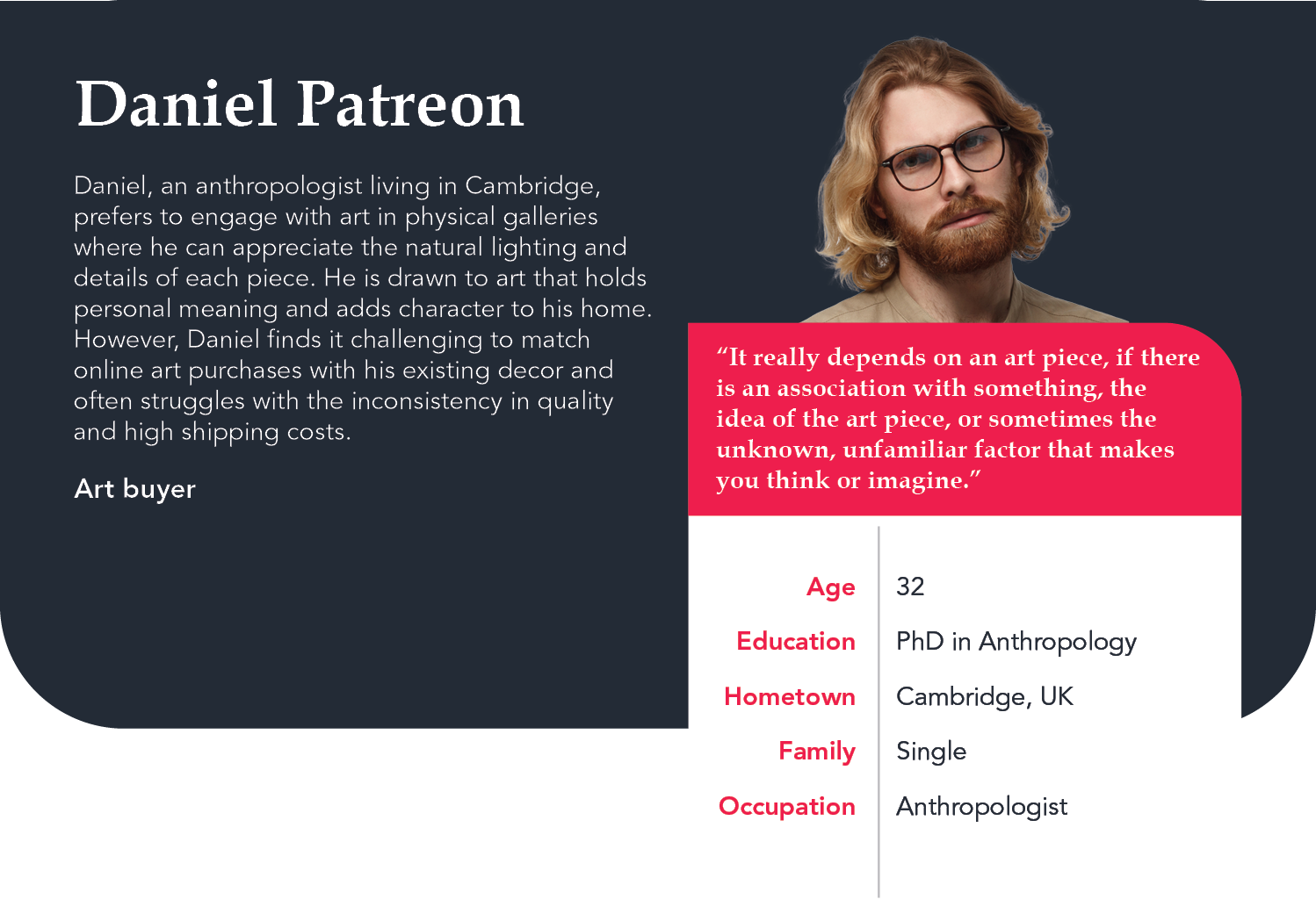


Fig 2. - Persona profiles & Emily’s user journey map
DEFINE
Synthesis phase
Aim /
Clarify the app’s value proposition and unique features in a
saturated e-commerce market, guided by user personas.
Process / Synthesised insights from competitor analysis and personas to outline core value propositions, then mapped user flows and information architecture (Fig. 3) to define structure and screens.
Key value propositions /
Outcomes / Competitor Audit, Storyboards, Information Architecture, User Flow
Process / Synthesised insights from competitor analysis and personas to outline core value propositions, then mapped user flows and information architecture (Fig. 3) to define structure and screens.
Key value propositions /
- Curated Artwork Recommendations - Personalised suggestions based on style, browsing, and purchase history.
- Expanded Filtering Options - Search by location, artist, style, medium, and price.
- Inbuilt Camera Tool - Visualise artworks in users’ spaces with scale and colour matching.
Outcomes / Competitor Audit, Storyboards, Information Architecture, User Flow


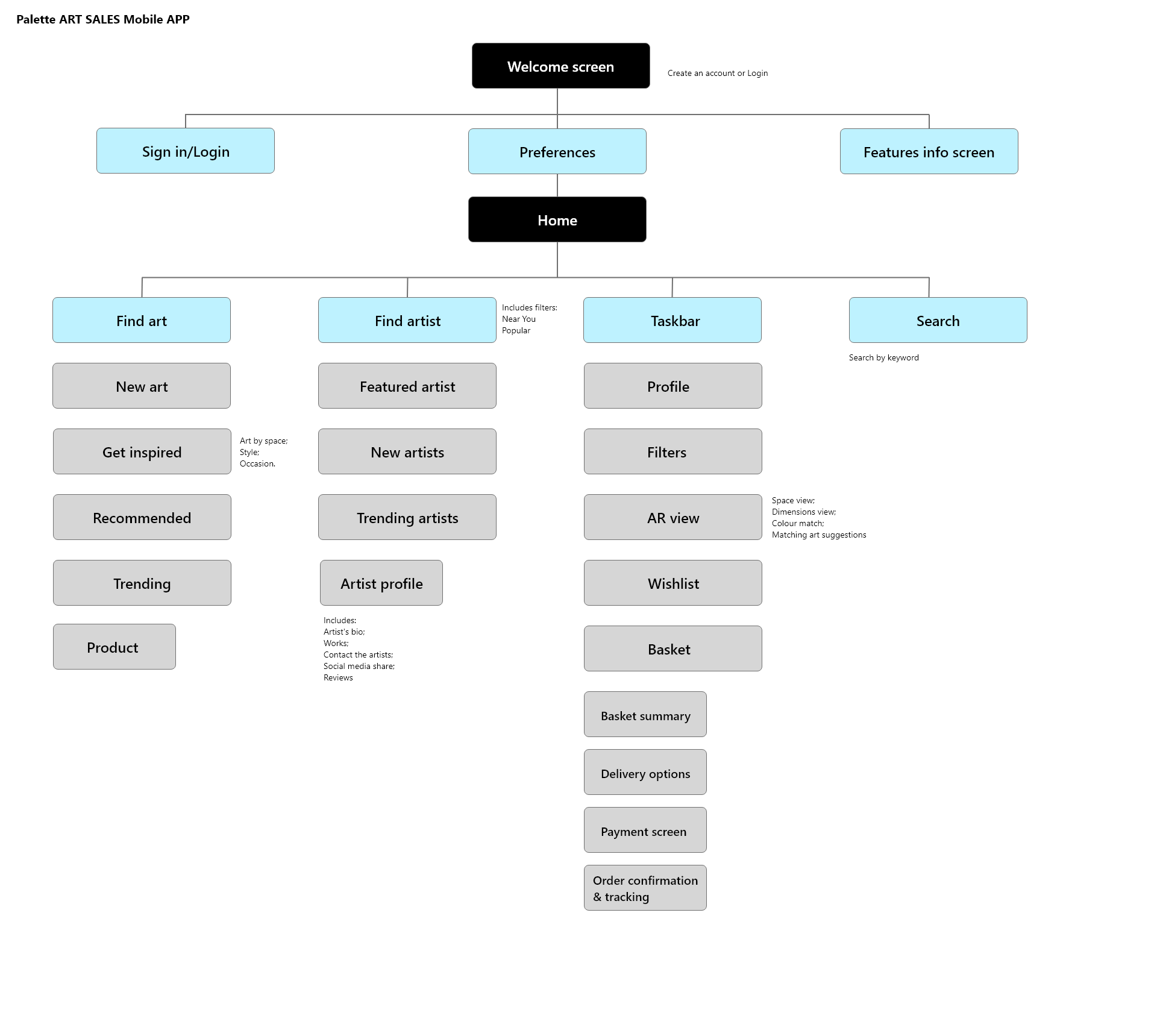

Fig 3. - Storyboard, IA (Mobile app & Responsive website), User Flow
IDEATE
Exploration phase
Aim /
Develop initial concepts for the mobile sales app, focusing
on solutions to key user pain points.
Process /
Findings /
Outcomes / Wireframes, Low-fidelity prototype
Process /
- Sketched paper wireframes to quickly explore layout and features.
- Created digital wireframes to refine ideas and prepare for early testing.
- Prioritised advanced filtering options and AR functionality to help users preview artwork in their spaces.
- Conducted the first round of remote unmoderated usability testing to validate core concepts.
Findings /
- Clear direction on filtering and AR features as primary differentiators.
- Early feedback to guide the move toward high-fidelity prototypes.
Outcomes / Wireframes, Low-fidelity prototype

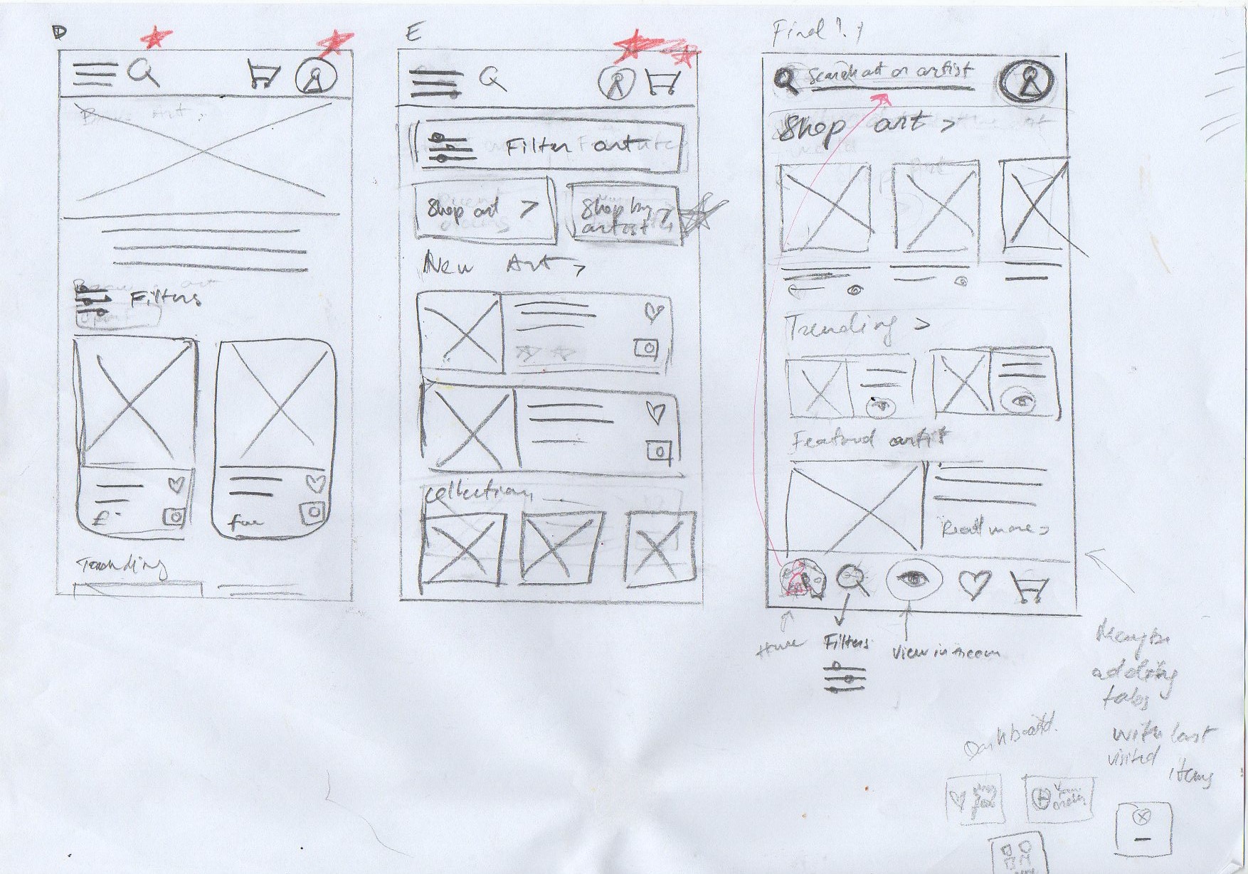


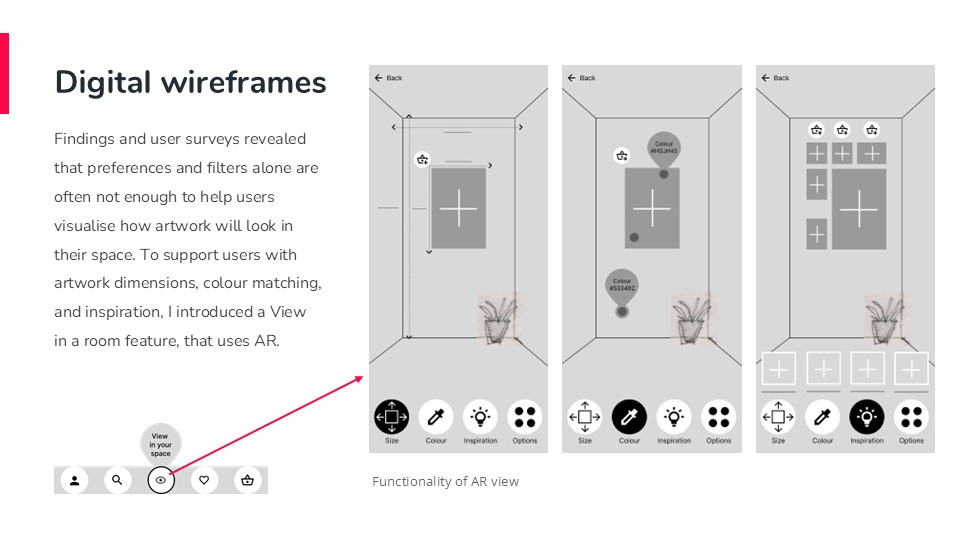
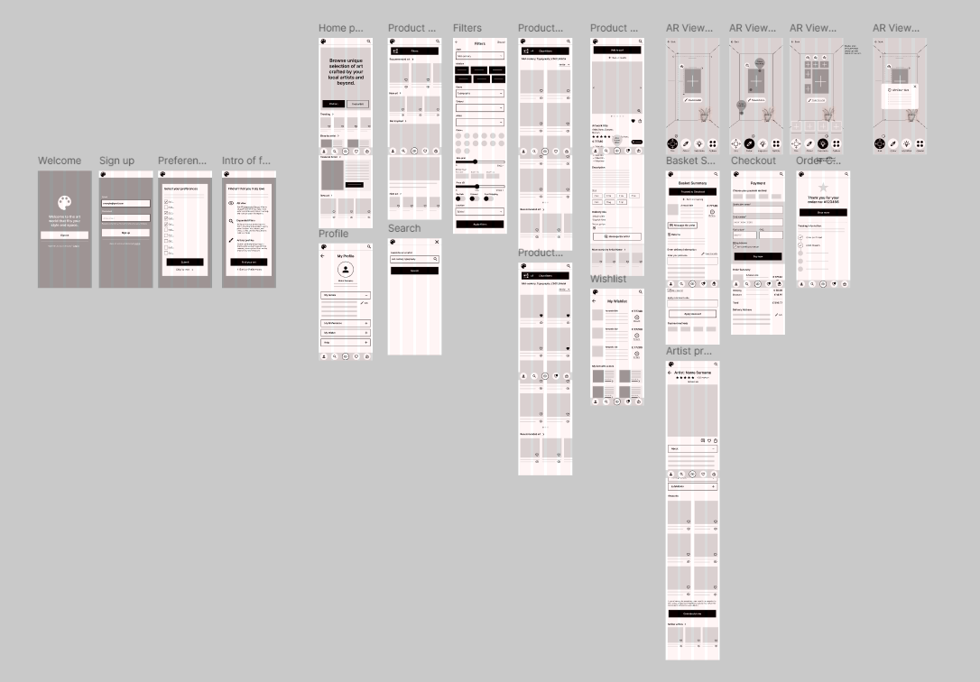
Fig 4. - Wireframes, Low-fidelity prototype.

TESTING
Iterations phase
Aim /
Validate
design decisions and identify usability issues through iterative testing.
Process /
Key findings /
Round 1 (Low-fidelity prototype)
Round 2 (High-fidelity prototype)
Process /
- Conducted two rounds of remote unmoderated usability studies (4 participants each).
- Analysed screen recordings from both low- and high-fidelity prototypes to capture user behaviour and feedback.
Key findings /
Round 1 (Low-fidelity prototype)
- Users
missed “Go Back” options.
- The “Add
to Cart” button needed to be more prominent.
- Uncertainty around how the AR feature works.
Round 2 (High-fidelity prototype)
- The AR feature was difficult to locate.
- Taskbar icons were unclear and rarely used.
- Some terms in the Preferences screen caused confusion.


DESIGN
Implementation phase
Aim /
Translate research and defined features into an
interactive prototype and visual identity that highlight the artworks while
ensuring accessibility.
Process / I created high-fidelity interactive prototypes using Figma, where I focused on:
User flows/
Accessibility Enhancements /
Outcomes / High fidelity prototypes (Fig 7, Fig 8, Fig 9), Interactive prototypes.
Process / I created high-fidelity interactive prototypes using Figma, where I focused on:
- Created a style guide and branding with a minimal palette and one accent colour to keep focus on the artworks.
- Designed and tested key screens to refine usability and flow.
- Built user flows to replicate a typical journey: account creation, searching via filters, viewing artworks in AR, exploring artist details, and completing checkout.
- In addition, I designed a responsive website to complement the app and extend its reach to a wider audience.
User flows/
- Account sign-up
- Product search
- AR view
- Checkout
Accessibility Enhancements /
- Labels added beneath taskbar icons for clarity.
- Swipe gesture icon introduced alongside arrows in Preferences for easier navigation.
- Colour palette meets AA accessibility standards with clear text hierarchy.
Outcomes / High fidelity prototypes (Fig 7, Fig 8, Fig 9), Interactive prototypes.
PROTOTYPES
PROTOTYPES


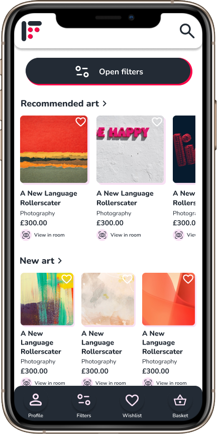
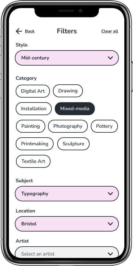


Fig 7.- Mobile app view


Fig 8.- AR View options
USER FLOWS
USER FLOWS
#
Account sign-up
# Product search
# AR View
# Checkout
DESKTOP
DESKTOP


Fig 9.- Desktop view - responsive website
DESKTOP FLOW
DESKTOP FLOW
RESULST & REFLECTION
Quote
“ I
would use this app 100%.” - Usability study participant
This project shows the potential to expand local art sales
by strengthening the connection between buyers, local artists and makers. It
demonstrates how usability studies, even with a small group, reveal critical
design gaps and drive meaningful improvements before development.
Next Steps / To build on these insights, I plan to:
Next Steps / To build on these insights, I plan to:
- Enable a customisable Home screen for more personalised discovery.
- Add visual filter options to improve accessibility and recognition.
- Introduce organised Wishlists so users can categorise and manage saved artworks.