Riding Wheels
System design
Duration: 2 weeks
Introduction
Client / Self-initiated brief
Brief / Riding Wheels is an emerging automotive company with an already large staff base. Their staff are required to complete regular training and development, and Riding Wheels wanted to provide an easy-to-use Learning Management System (LMS) where their staff could monitor, book and record their mandatory training.
Riding Wheels requested the creation of two responsive pages for this new LMS - a Staff List and a Staff Profile page (Manager's side).
Why / Challenge my brainstorming and design sprint skills, explore the design and usability of complex systems and IA, and see what solutions I can find in a limited period.
Challenge / Making the site easy to use for monitoring training (Manager), incorporating functionality within the responsive design, designing for the busy, on-the-go person (Fig 1.), and prioritising crucial viewing information.
Highlights/
My role / UX researcher, UX/ UI Designer and Graphic Designer (Branding)
Brief / Riding Wheels is an emerging automotive company with an already large staff base. Their staff are required to complete regular training and development, and Riding Wheels wanted to provide an easy-to-use Learning Management System (LMS) where their staff could monitor, book and record their mandatory training.
Riding Wheels requested the creation of two responsive pages for this new LMS - a Staff List and a Staff Profile page (Manager's side).
Why / Challenge my brainstorming and design sprint skills, explore the design and usability of complex systems and IA, and see what solutions I can find in a limited period.
Challenge / Making the site easy to use for monitoring training (Manager), incorporating functionality within the responsive design, designing for the busy, on-the-go person (Fig 1.), and prioritising crucial viewing information.
Highlights/
- Conducted competitor audits and analysis to define Manager needs and workflows.
- Created a Manager persona to guide interface and functionality decisions.
- Designed wireframes and high-fidelity prototypes, iterating based on usability feedback.
- Developed branding and visual style for a clear, accessible LMS interface.
My role / UX researcher, UX/ UI Designer and Graphic Designer (Branding)
Explore the process →From insight to implementation
Fig 1. - Riding Wheels LMS mobile view
DISCOVER
Research phase
Aim / To solve the needs of the manager by researching different LMS systems and understanding their functionality.
Process / I chose audit and analysis of competitor sites as my main research method. I was interested in how managers approach the admin side of the system and track the results of their students, and what the general interface looks like.
Second, I started looking at the reviews and feedback on various LMS, which were given by managers or people who are using LMS systems on the market. Specifically, I was looking into Talent LMS, Kallidus and SAP Litmos (Fig 2.).
Following my research and reviews from the managerial professionals, I got a better insight into the person (Manager) who will be using the system.
In this section, I defined the Manager's needs, pains, context, and values. Using Manager’s user profile (Fig 2.) as a guide, I could make informed decisions about the layout and the interface of the LMS pages, main functions and attributes.
Obstacles / Limited time for the research phase.
Outcomes / Online audit of competitor sites, User persona profile
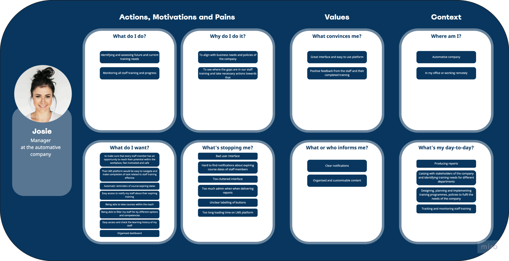

Fig 2. - Competitor audit, User persona (Manager)
DEFINE
Synthesis phase
Aim /
To translate research results and insights into potential solutions for the applications, paying attention to the Manager’s needs and tasks.
Process / Sketching multiple ideas (Fig 3.), refining them into wireframes and identifying any areas of improvement. At this stage, I also conducted usability testing with a few friends (Fig 3.), to gather their feedback on the functionality and interface; ensuring it was logical and easy to follow.
Later, I created and defined branding for the new LMS. The inspiration for colours, shapes and patterns came from the parked cars on the streets in my neighbourhood and just exploring car services near me.
Outcomes / Sketches, Wireframes, Style sheet (Fig 4.): typography, colours, graphic components, buttons.
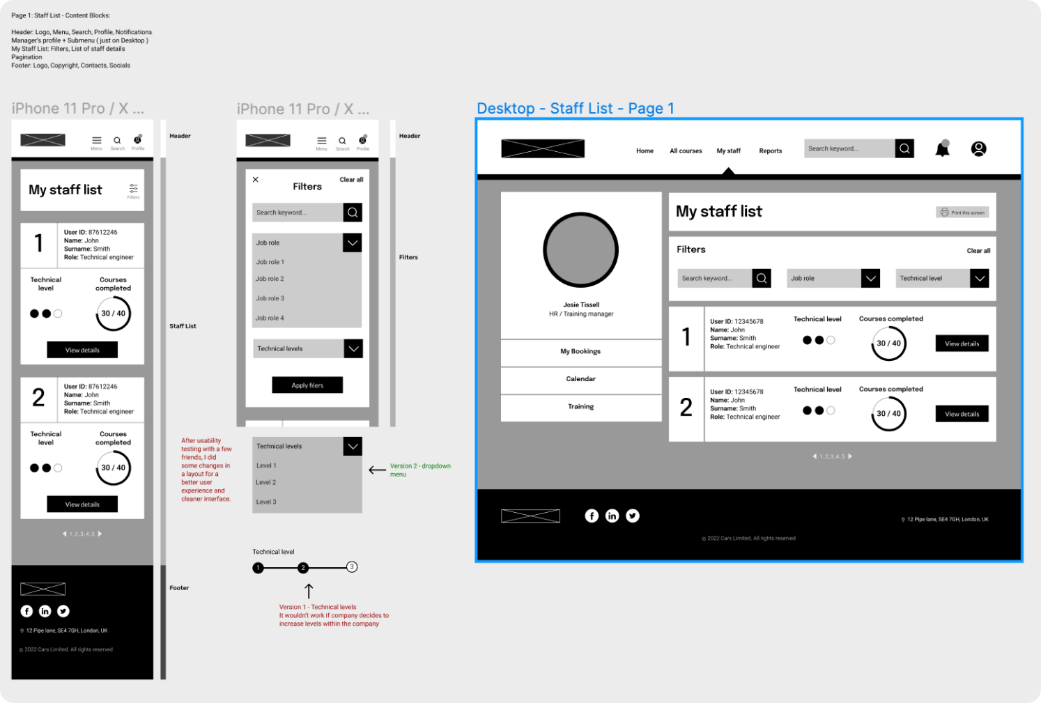

Fig 3. - Sketches, Wireframes and feedback from friends
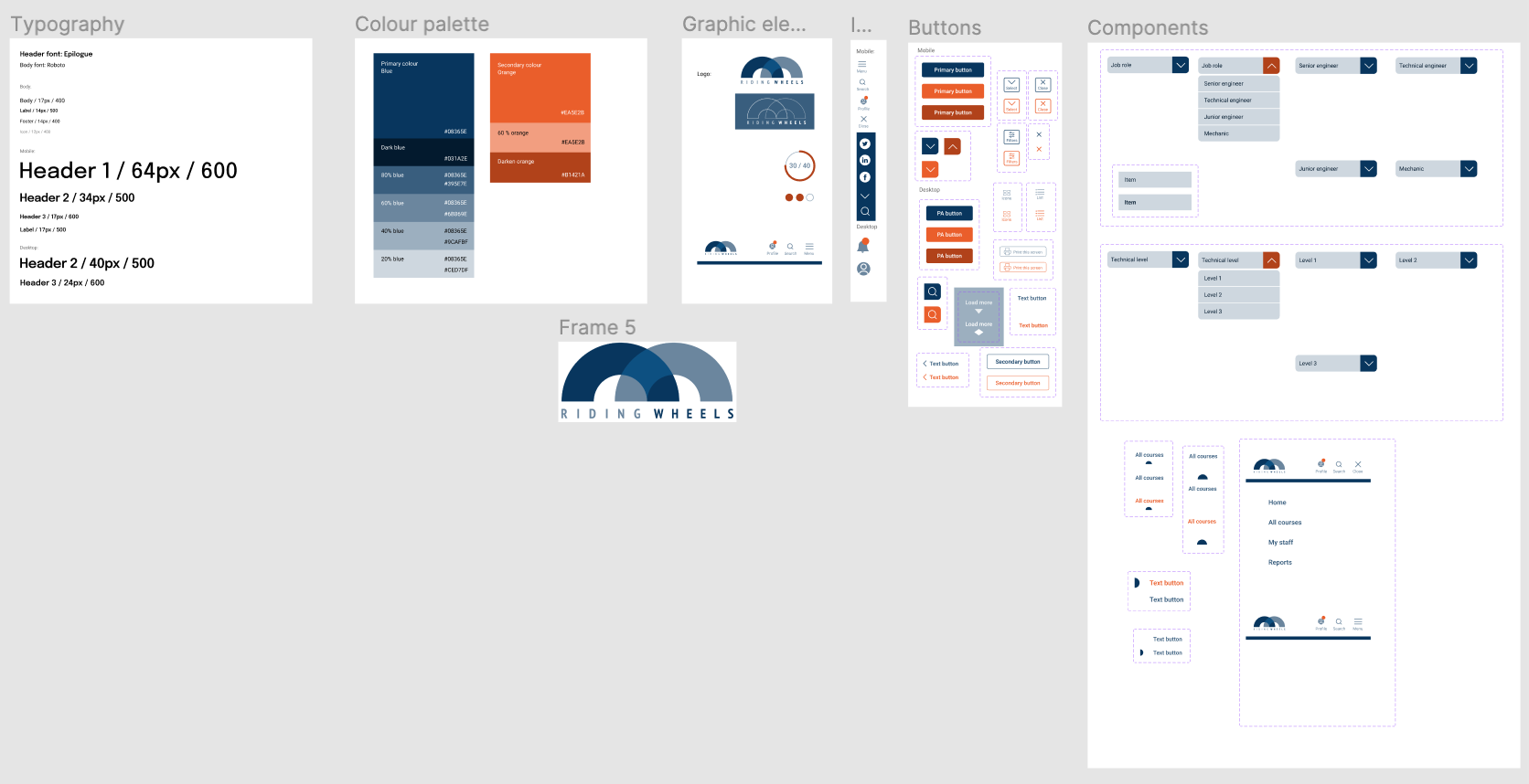
Fig 4. - Style sheet
DESIGN
Implementation phase
Aim /
To refine the design by implementing the feedback received from usability testing. Focusing on easy task completion and reducing visual noise by leaving just the most necessary information and functions was an important goal at this stage.
Process / I created high-fidelity prototypes using Figma, where I focused on:
Key user tasks /
Outcomes / High fidelity prototypes (Fig 5. & Fig 6.), Interactive prototypes (animated functions), User-testing.
Process / I created high-fidelity prototypes using Figma, where I focused on:
- Clean and simple interface
- Accessibility approved colour contract
- Hierarchy of information
Key user tasks /
-
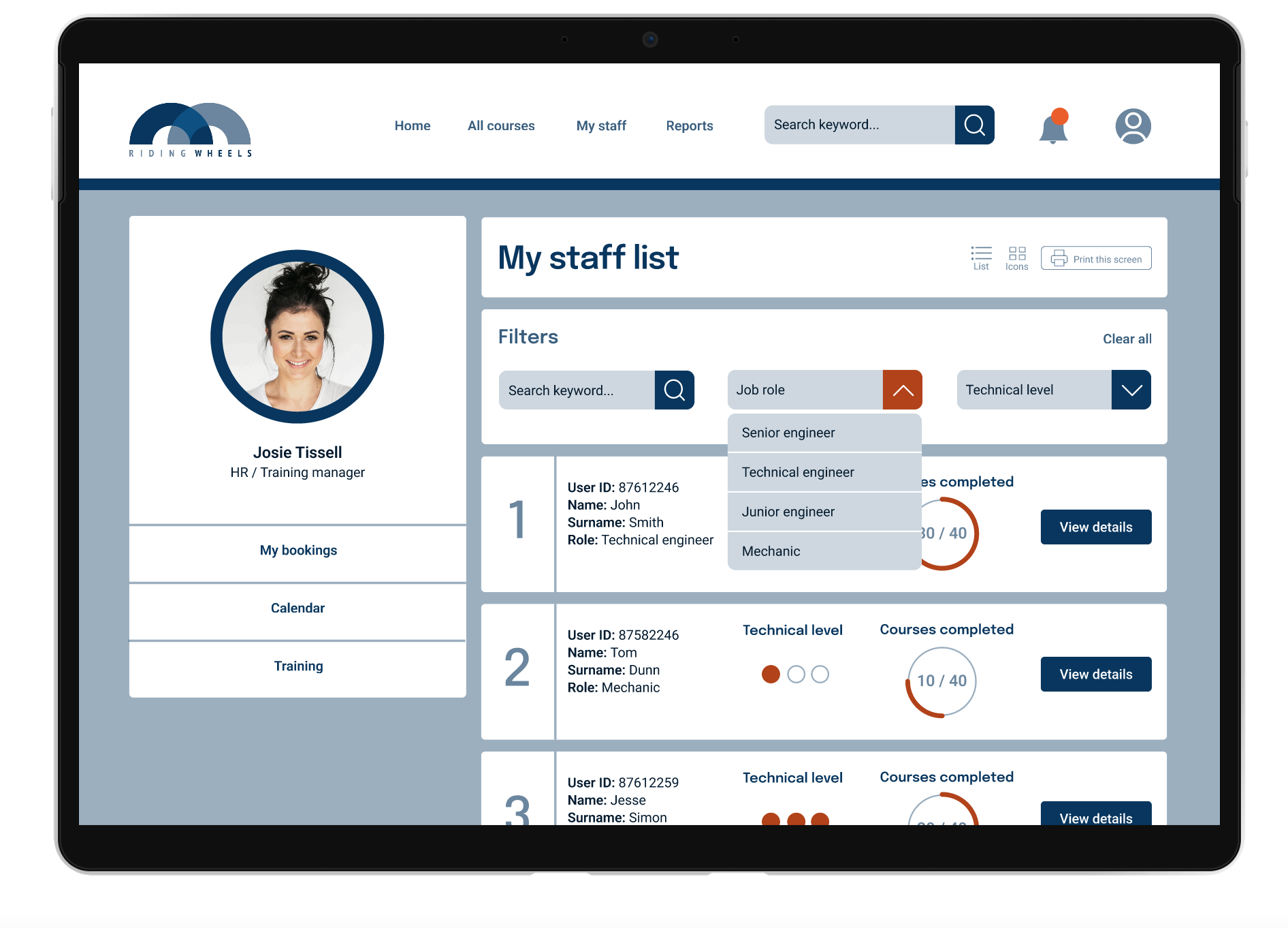
Viewing a list of all staff
- Sorting users by job role and qualification level (Filters)
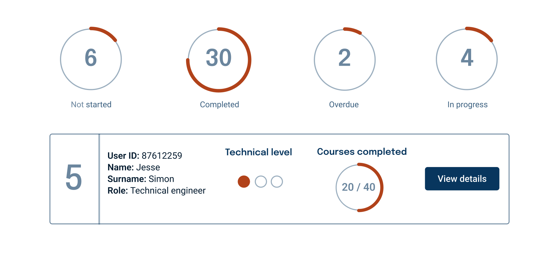
- Checking user course completion status
- Viewing user profile
- Checking learning history of the user
Outcomes / High fidelity prototypes (Fig 5. & Fig 6.), Interactive prototypes (animated functions), User-testing.

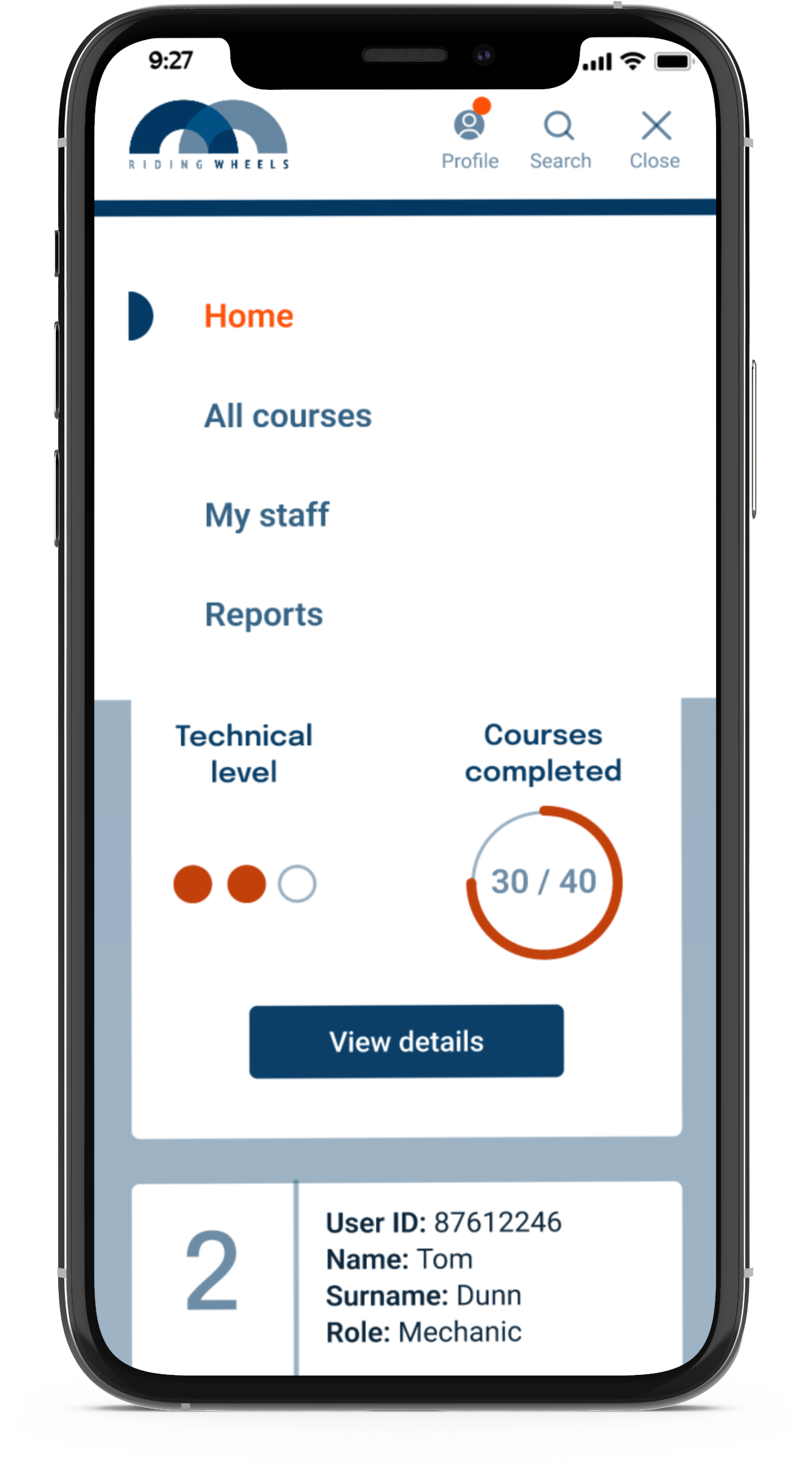
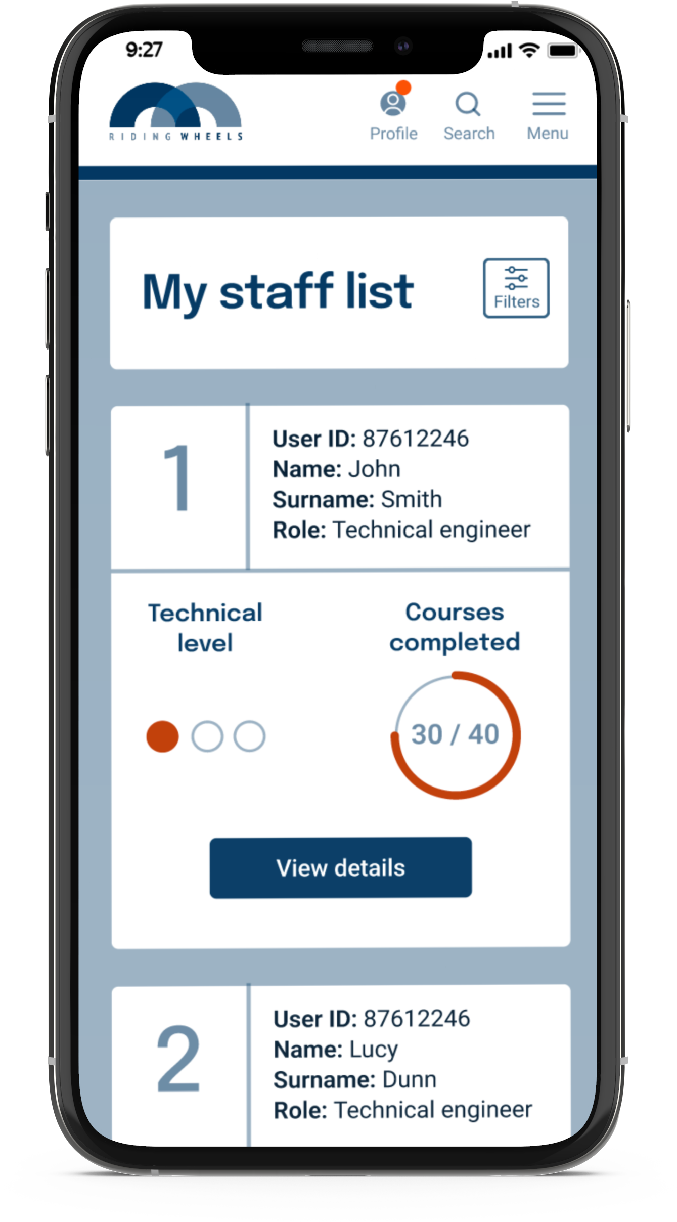
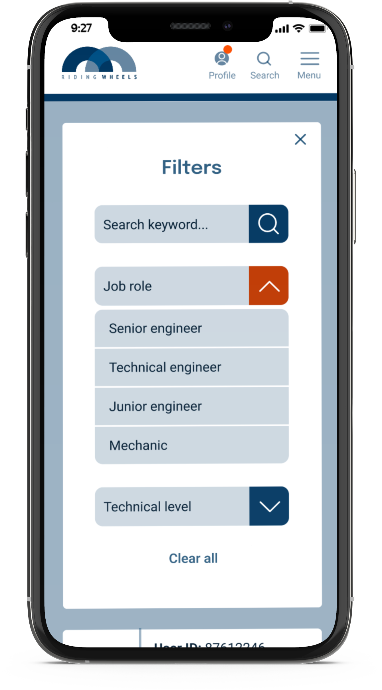


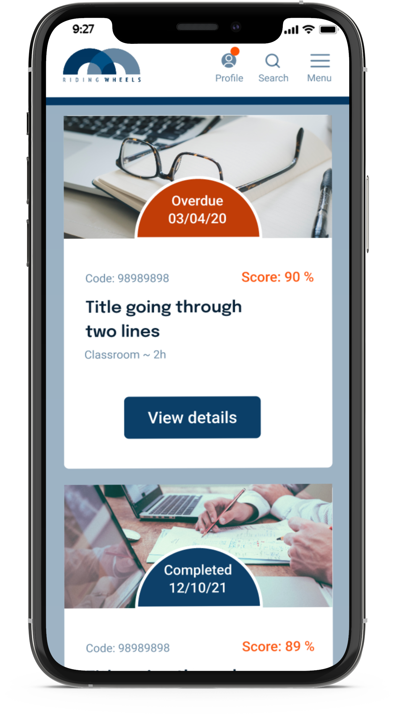
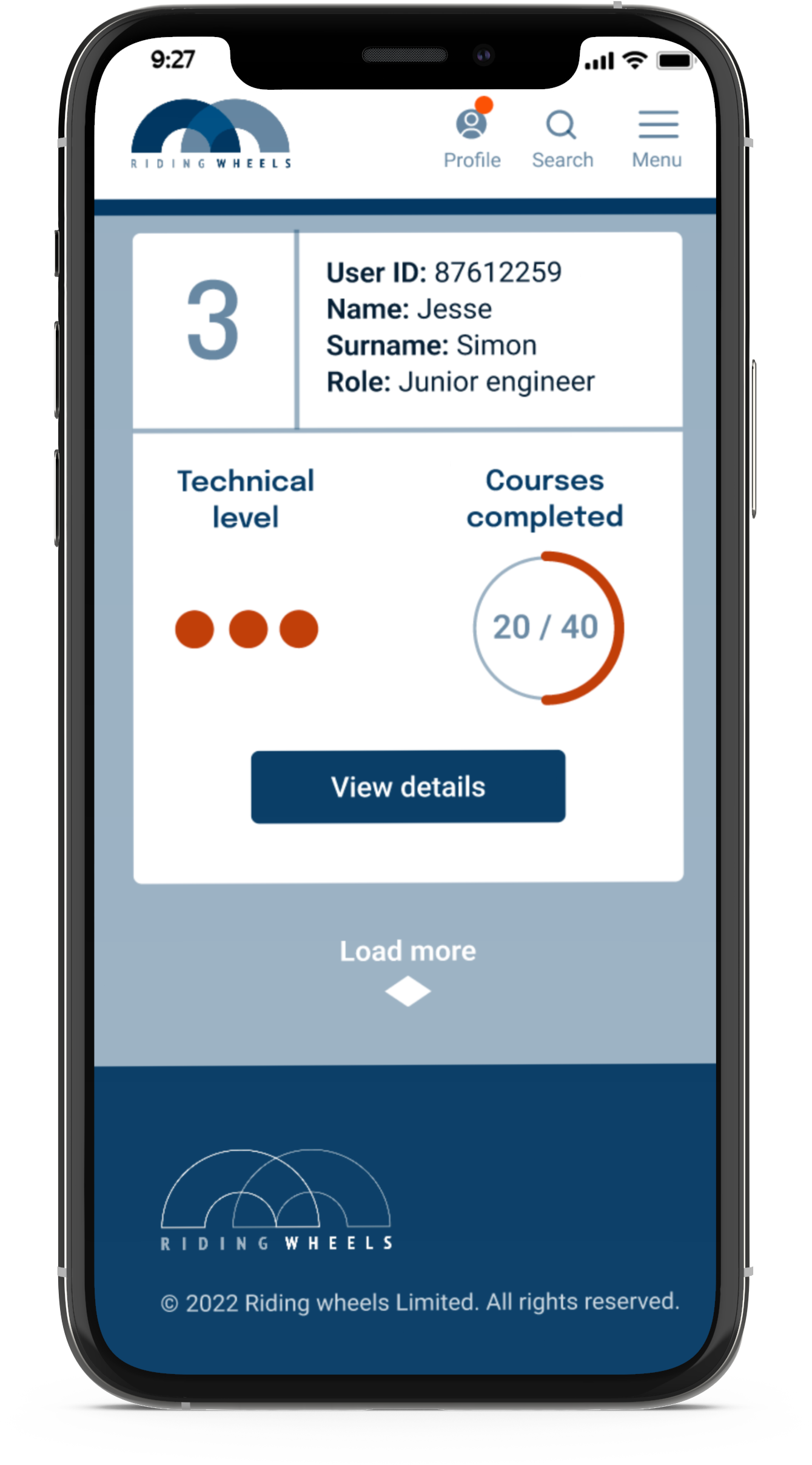
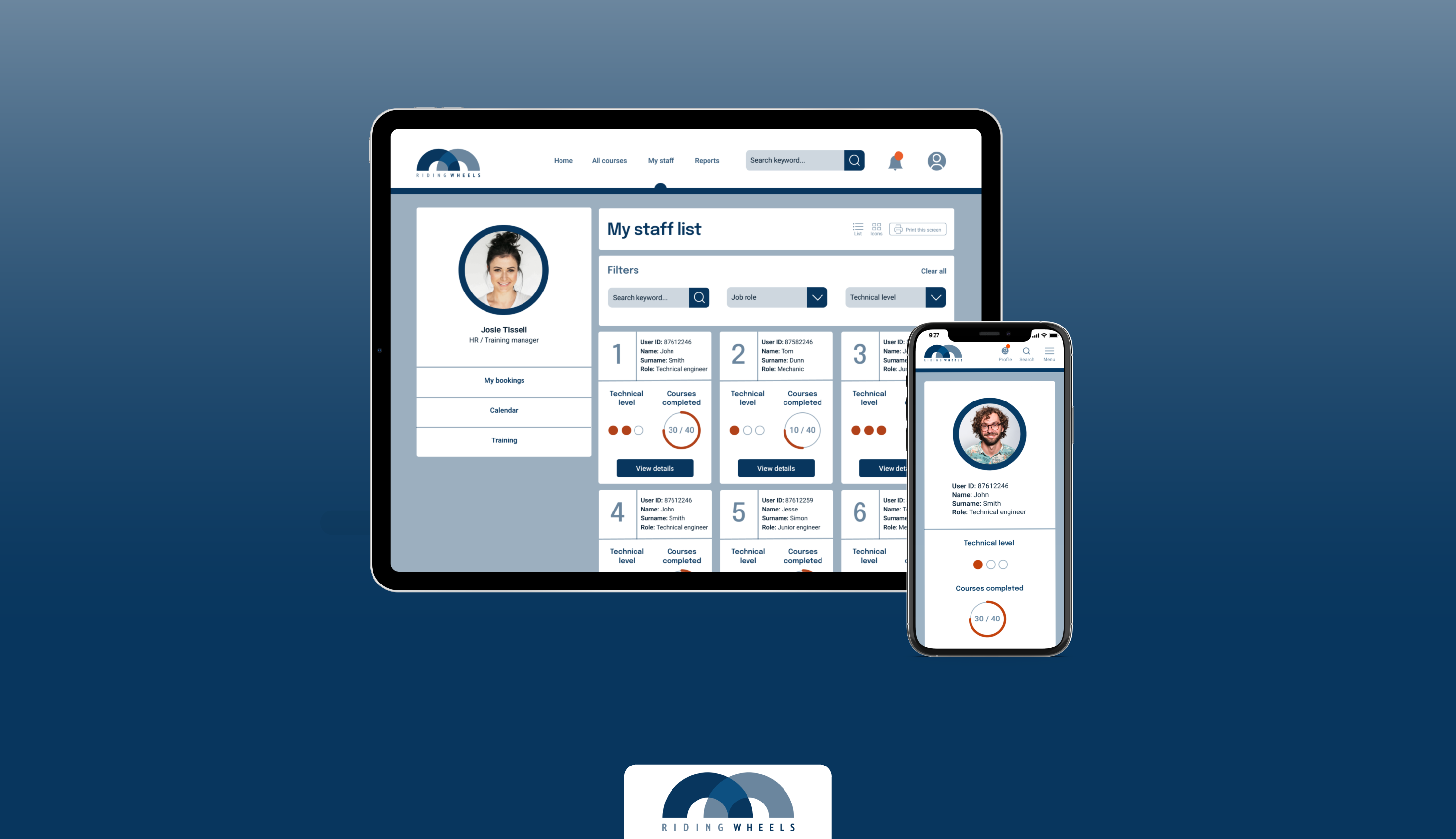
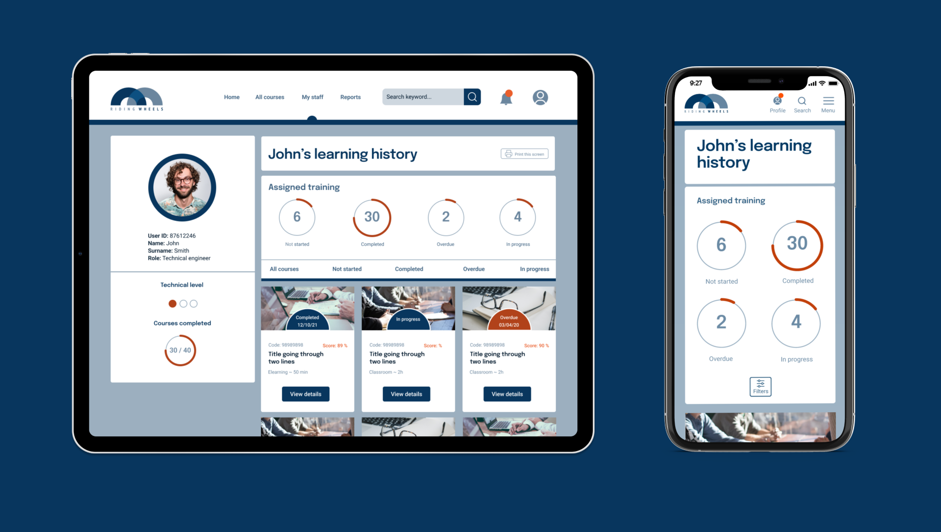
Fig 5.- Mobile view
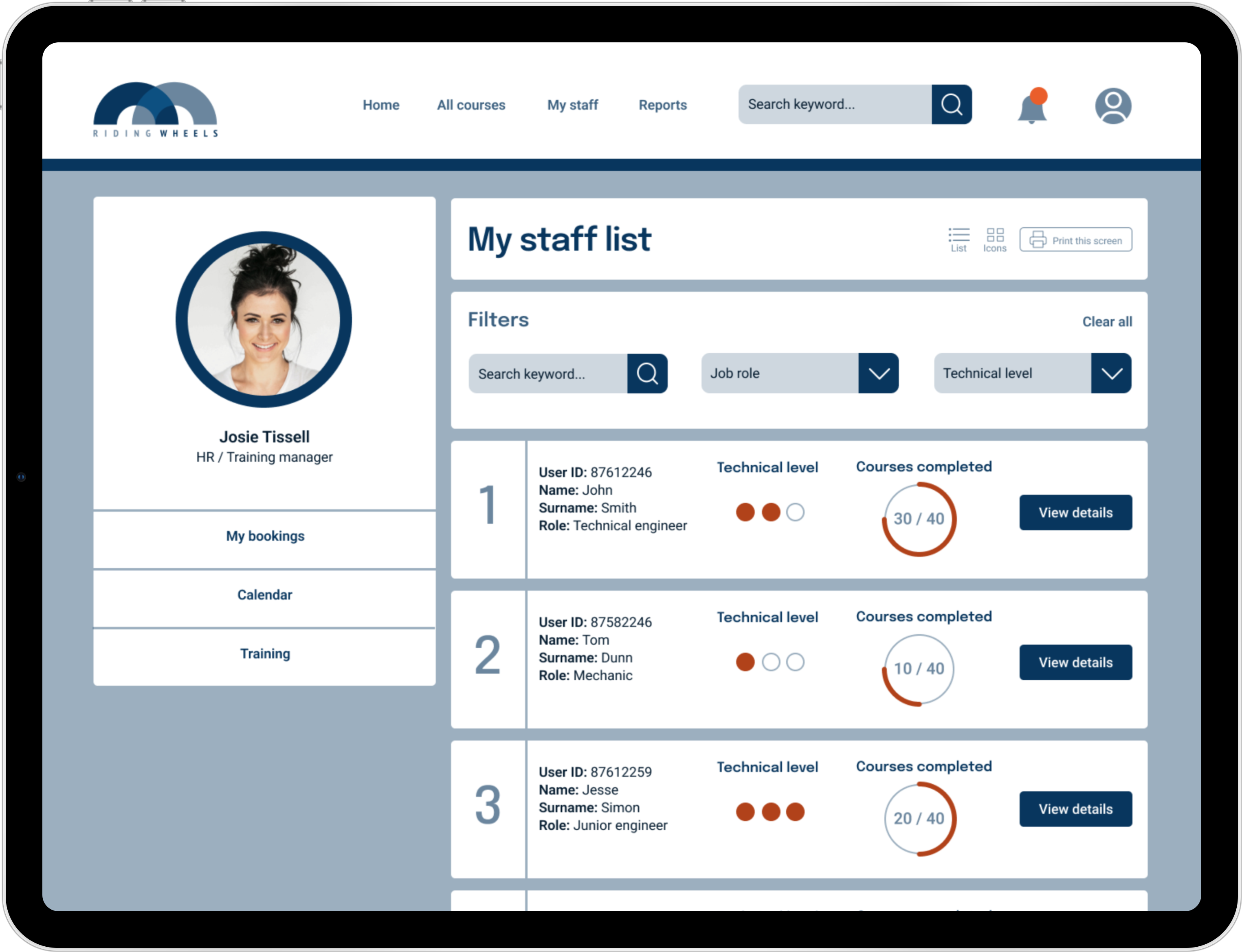
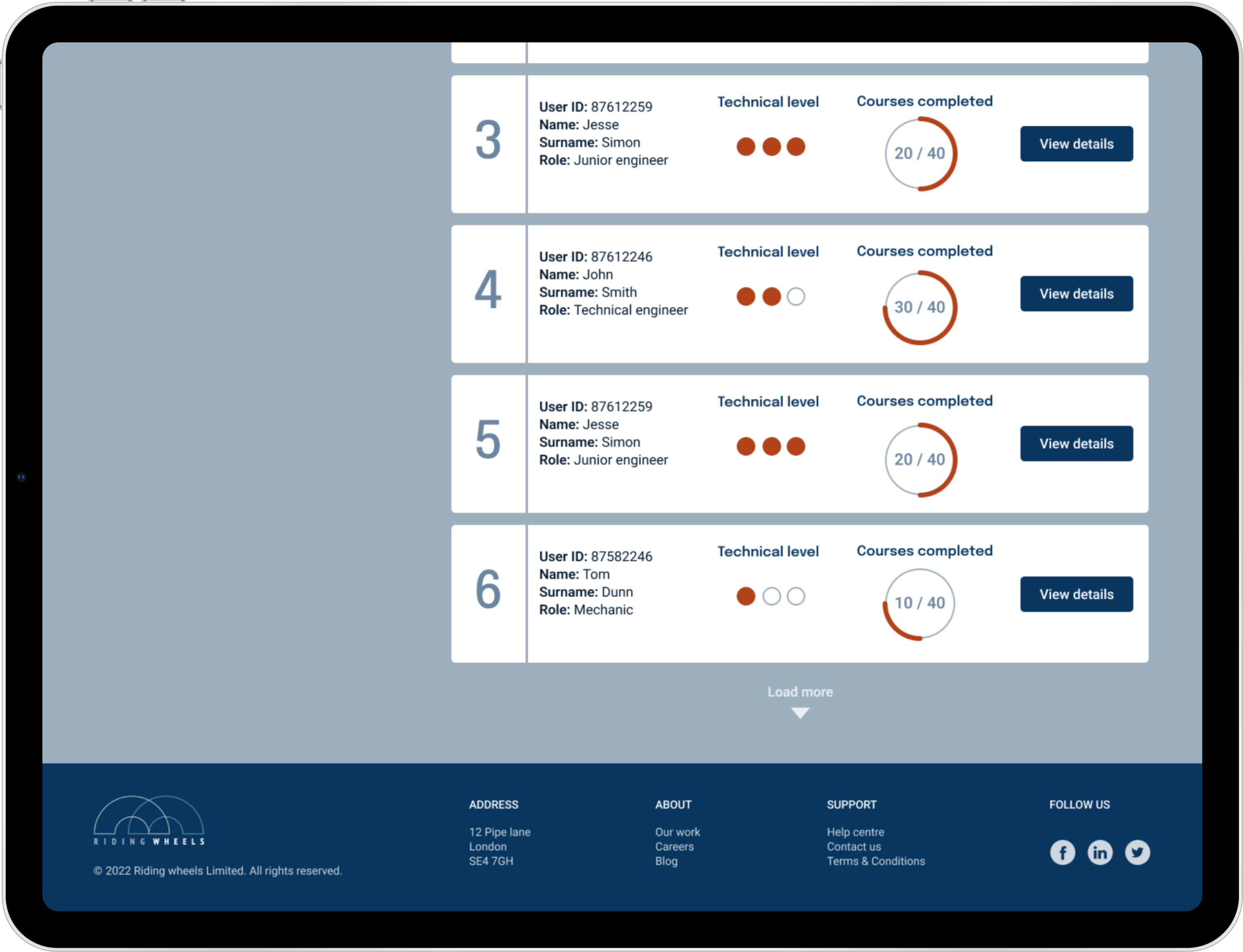
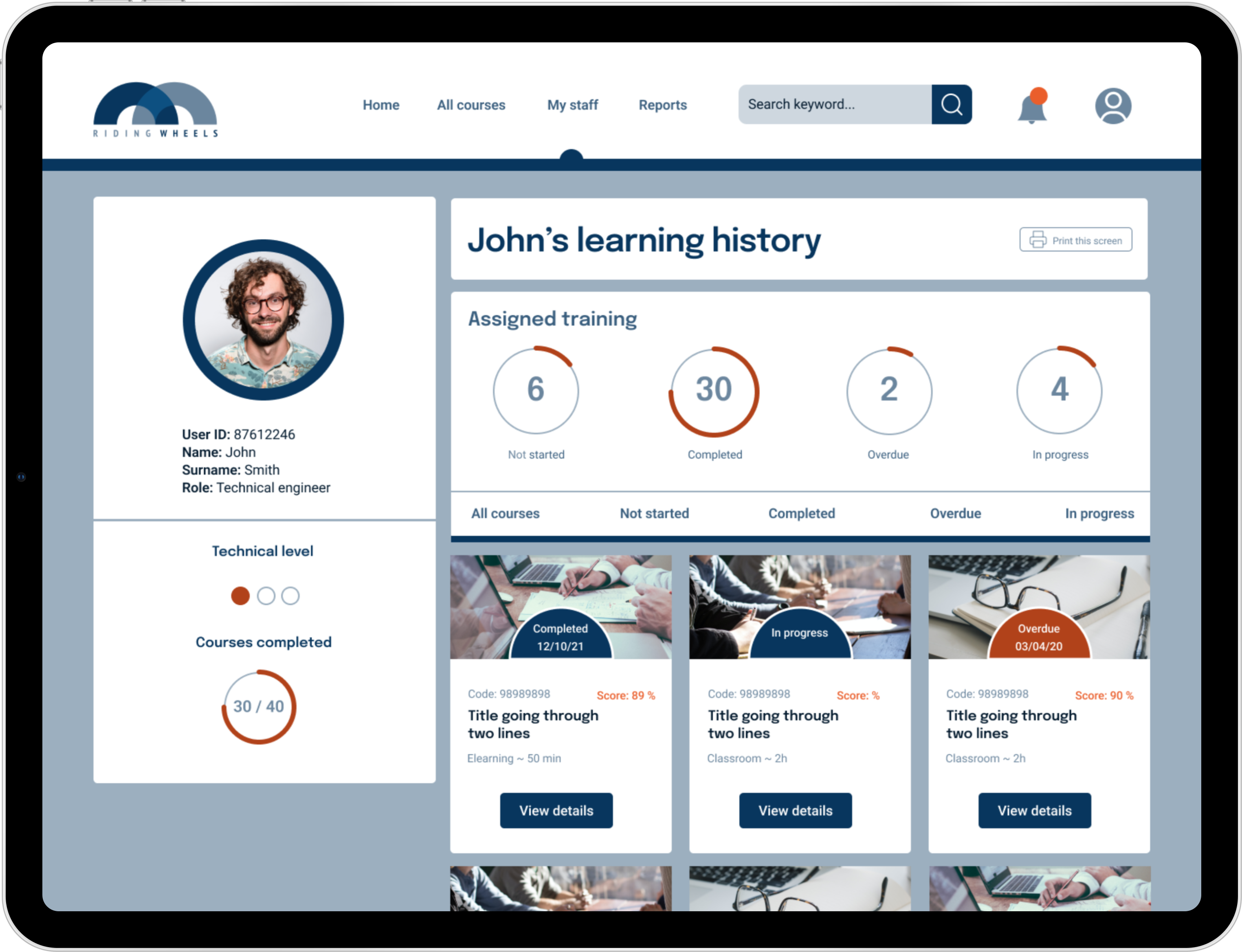

Fig 6.- Desktop / Tablet view
# Viewing a list of all staff
# Sorting users by job role and qualification level (Filters)
# Checking user course completion status
# Viewing user profile
The staff profile includes a user’s personal details and the core information about their training status, such as technical level and a number of courses completed.
A manager’s profile includes a secondary menu, which helps to stay organised and complete tasks more quickly.
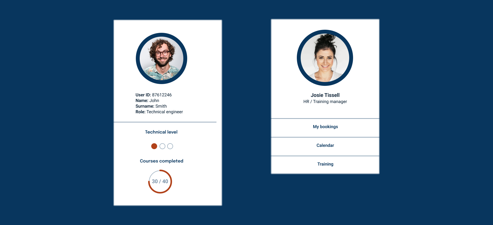 Note: A manager’s profile section is removed from the mobile version. In this case a manager can use
the Profile icon to access the submenu which is available on the desktop version.
Note: A manager’s profile section is removed from the mobile version. In this case a manager can use
the Profile icon to access the submenu which is available on the desktop version.# Checking learning history
FULL FLOWS
Full LMS prototype flow (Mobile).
Full LMS prototype flow (Tablet). Link to Figma prototype.
REFLECTION
Evaluation
This project required quick approach to the final design, due to limited time for research. Reviews and testimonials of HR managers from competitor applications were very useful sources to find what are the needs of the proto persona and define the functionality of the new product. I created a clean and simple design with a clear hierarchical structure with several sub-menus to help break down information and access all features.
Wireframe testing let me discard some design elements and duplicated functions. Second prototype testing helped to define user journeys by adding the additional page.
Obstacles / Limited time for branding, product research and limited user testing resources.
What did I learn? / It was a challenging task to design a new LMS from scratch (not a full scope). I learnt to be organised, extract data and concise research to a proto persona, which helped to inform my further design decisions. It was a great exercise for my design thinking, UX, interaction and prototyping skills.