The Matthew of Bristol

UX Design & UX Strategy
Duration: 2 months
Introduction
Client / The Matthew of Bristol Trust
Brief / The Matthew’s team identified that the website does not offer the best experience it can to its multitude of different users (Fig 1.).
Therefore, they would like to redesign their current site into a responsive website, with a mobile-first approach, that can offer an engaging experience of The Matthew with an easy booking and donation processes to its multitude of different users.
Challenge / Creating an engaging website, which tells the story of The Matthew, simplifying the booking process online, reducing admin times for a small team, and increasing sales and donations.
My role / Design Researcher, UX / UI Designer - this project was an outcome of my UX design course at the Develop Me academy.
 Fig 1. - Before: The Matthew of Bristol website
DISCOVER
Research phase
Aim / It was essential to identify the main issues with an existing website. First of all, we needed to get an in-depth understanding of how current users were interacting with the website and what problems they were facing.
Process / My colleagues and I conducted the following research methods:
From the collected findings we prioritised three main groups of the audience:
Therefore by solving their needs with the website, we solve the needs of everyone else.
Hypothesis /
Outcomes / Affinity diagrams, Customer (guerilla) surveys, quality stakeholder interviews, and Discovery output.
Process / My colleagues and I conducted the following research methods:
- Competitor analysis
- Stakeholder interviews
- Guerilla interviews (Fig 2.)
- Card sorting
From the collected findings we prioritised three main groups of the audience:
- OLDER GENERATION
- EDUCATION
- PRIVATE HIRE
Therefore by solving their needs with the website, we solve the needs of everyone else.
Hypothesis /
“ The current website does not offer a rich and engaging story about The Matthew and the lack of user-centred approach diverts potential and existing customers to the competitor sites, affecting the ship's revenue and maintenance.”
Outcomes / Affinity diagrams, Customer (guerilla) surveys, quality stakeholder interviews, and Discovery output.
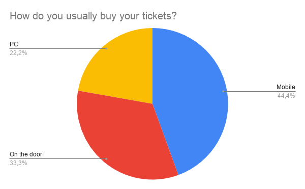
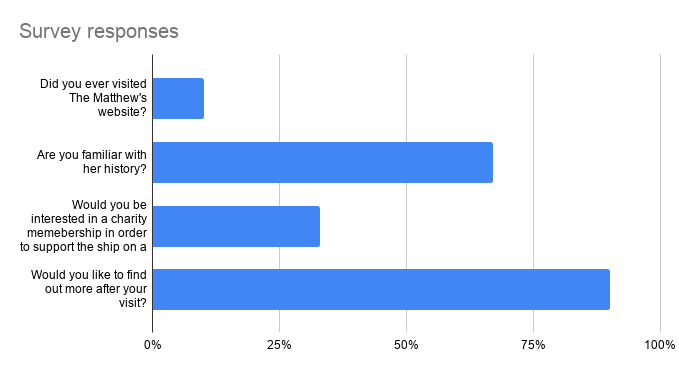

Fig 2. - Guerilla interviews: findings
DEFINE
Synthesis phase
Aim / to empathise with the user and find out how redesigning the booking process will help to improve their experience of visiting The Matthew.
Process / Following our results and data, I was assigned to create a Family visitor persona (which falls into the EDUCATION category - Fig 3.) and its Customer Journey map. I collected all the data from our diagrams and interviews, which resulted in a more concise picture of a regular family visitor of The Matthew.
Mainly, I was focusing on the booking journey, therefore visualising present and future task flows helped to define issues within the booking process.
Afterwards, we produced an IA site map for a future website containing all information from our research and findings and also getting a session with stakeholders to find out the most convenient solution.
I was working on a VISIT section, which focused on Accessibility and Facilities parts.
Outcomes / Family visitor persona, Customer Journey, IA site map, Task Flows (Fig 4.).
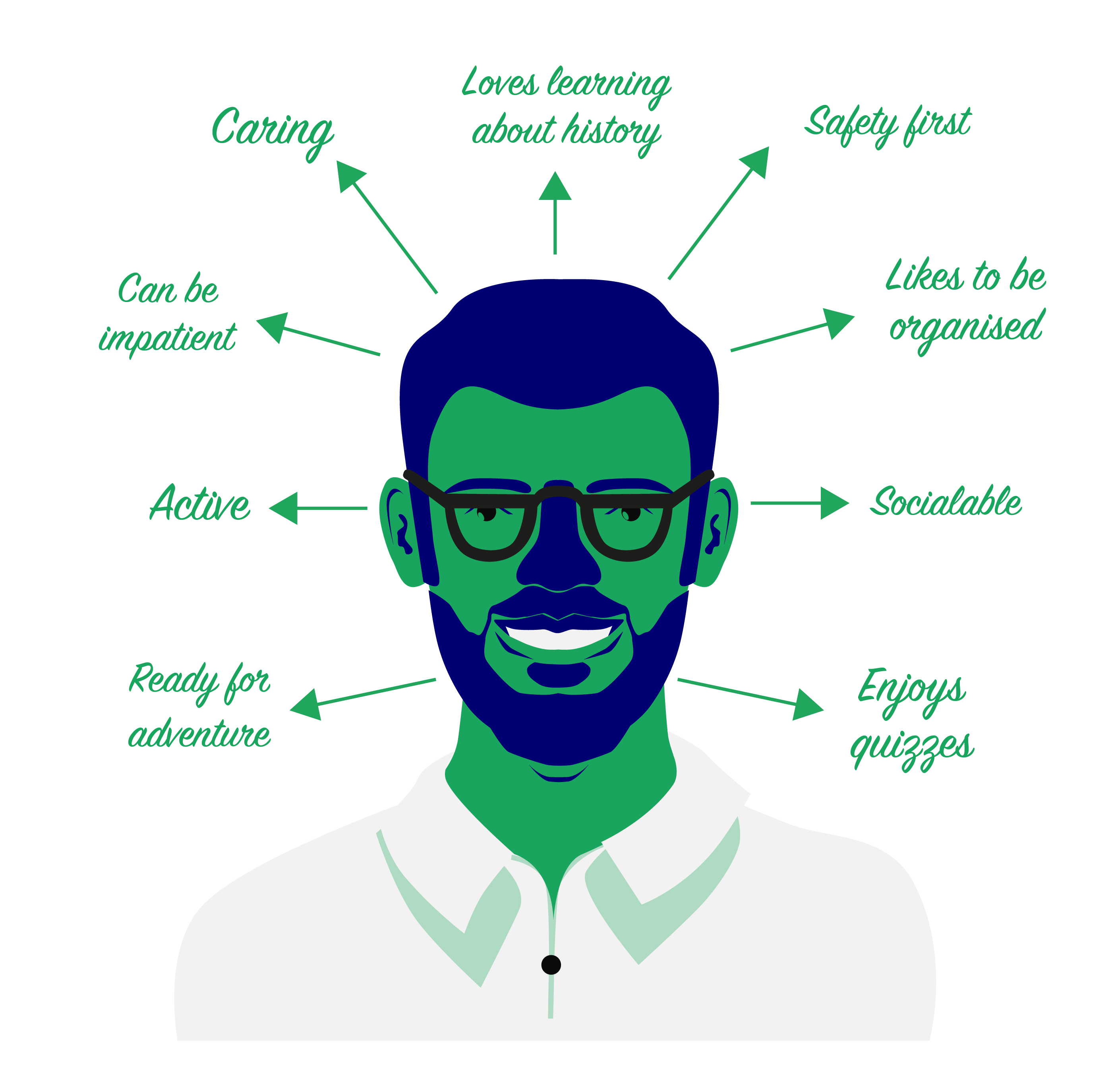
“As a busy dad, I want to have an easy booking process on The Matthew website, so that it won’t make me frustrated and angry.”
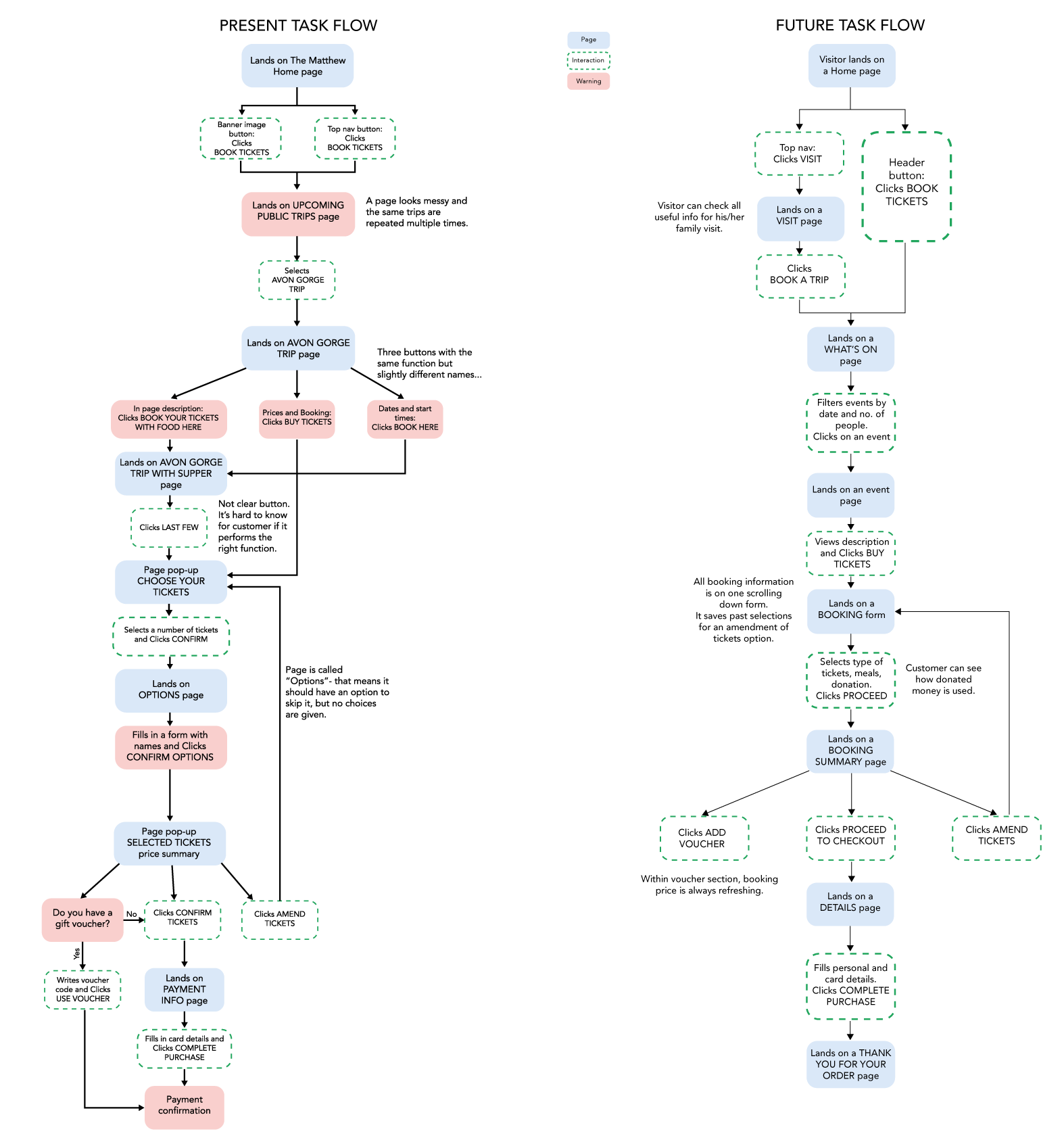
Fig 4. - Task flows (Booking process)
DESIGN
Implementation stage
Aim / Create a working high fidelity interactive prototype for an improved ticket booking process on a mobile app.
Process / In two weeks time on a part-time UX course, I refined my idea through sketching and wireframing, completed usability testing with my course pairs, produced a high fidelity prototype and presented it to the client.
Concept statement / A mobile app that seamlessly facilitates planning, booking and donating functions.
Redesign goals /
Simplify booking process.
Design with empathy in mind.
Create a seamless experience focusing on functionality, readability and clarity.
Keep it within a historic sense and approach.
Outcomes / Sketches, Wireframes, High fidelity prototypes, Interactive prototype.
PROTOTYPING
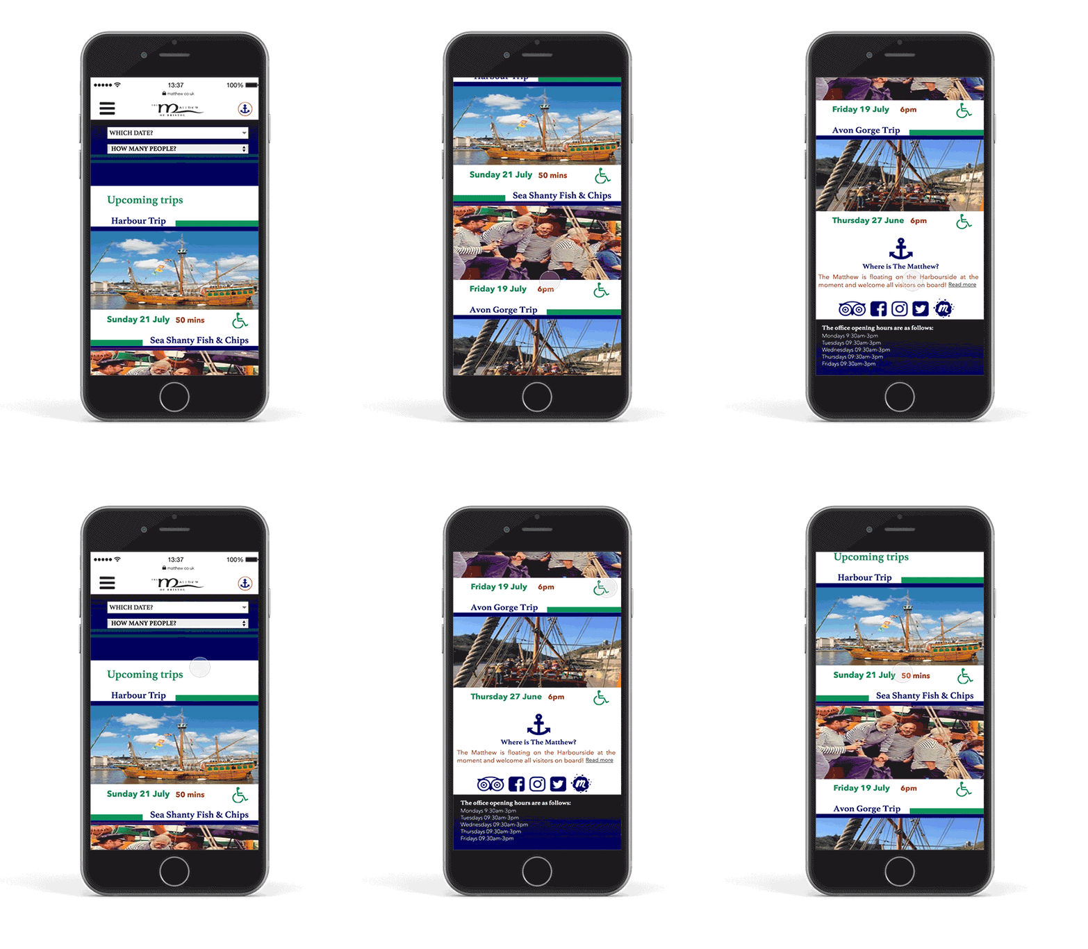
#/ Tasks addressed in the redesign:
#1 Where is The Matthew?
The entry to the booking form starts on the WHAT'S ON page which features the main events that happen on The Matthew. The anchor in the top right corner is a CALL button that shows the exact location of the ship live. This way potential customers can check where The Matthew is and plan their trip accordingly.
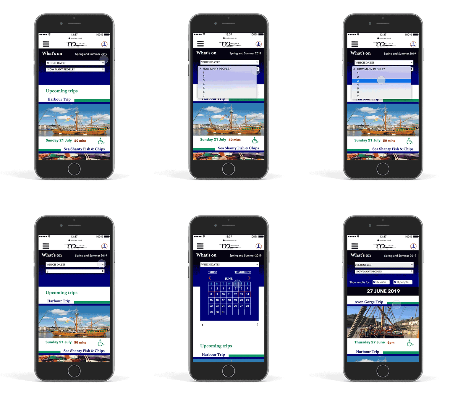
#2 Calendar and Filter functions
In the original design of the website, all events were clustered on one page showcasing them not by the name but by the date, which ended up looking like duplicates but not as separate events.
The proposed solution for this problem was to introduce filters by date and number of people, due to a limited number of places available on some trips.
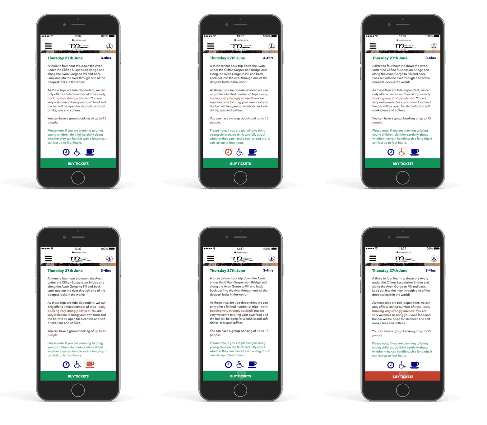
#3 Accessibility and Facilities buttons
To ease the stress for families, older people, schools or anxious visitors I decided to introduce extra informational buttons on an EVENT page. They are just recommendations that could link with the Accessibility and Facilities sections on a VISIT page or have a pop-up window with the most necessary information on it.
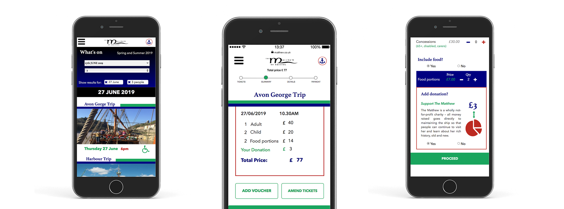
#4 Booking form features and functionality
A booking form redesign was my main goal for this project. I wanted to make it user friendly and delightful as much as possible for all personas we were designing.
I decided to consolidate separate forms in a booking process and put them on one scrollable page. It features multiple choices and YES / NO radio buttons for optional choices.
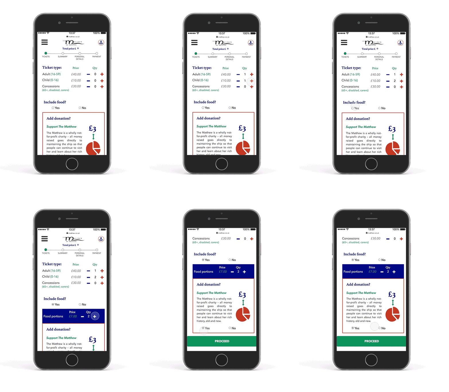
#5 Total Price Summary and Details pages
The total price summary page shows a price breakdown and gives different choices to ADD VOUCHER, AMEND TICKETS or PROCEED to checkout.
By removing an 'optional' guests’ name filling form I suggested leaving just the contact details of the buyer and their credit card information sections. It significantly shortened the booking task flow for potential customers. To acquire the names of other visitors the customer will receive an automatic request via email provided.
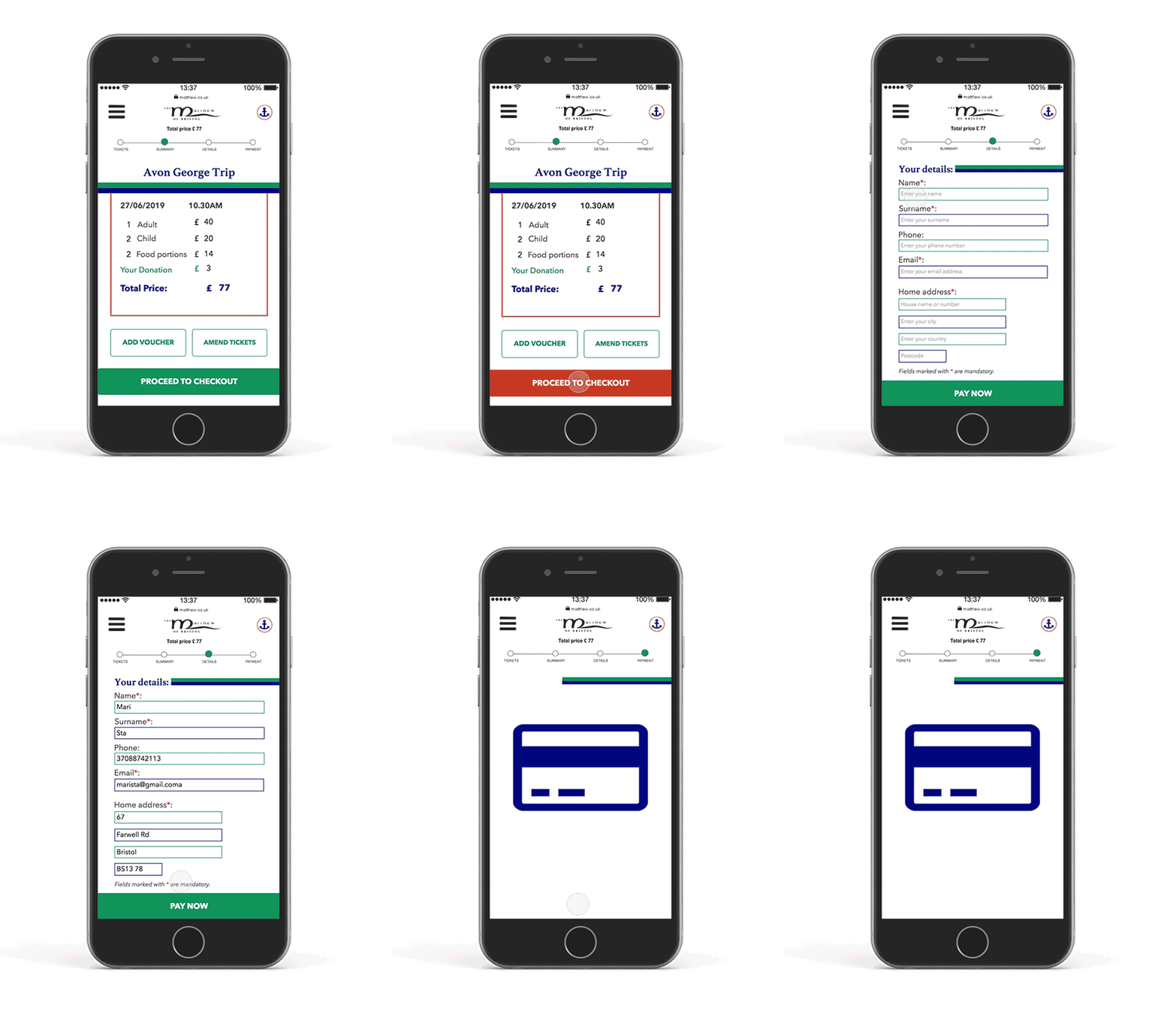
#6 Progress Bar
As an extra feature, I introduced a progress bar which shows at which part of the booking process the customer is. It helps to see how long is left and what to expect later. Also by pressing on a highlighted circle the user can go back to different stages of the form and edit it, while the total amount is always refreshing.

Evaluation
After usability testing and gathering
feedback from peers and colleagues, this prototype was handed to the client as a part of a final UX course presentation. Matthew’s team have been overwhelmed by possibilities of what they can do to improve their website and make it more delightful to use (Fig 5.).
Extensive research with interviews, surveys and discovery workshops helped to find solutions in reducing admin times for The Matthew’s team, engaging visitors to know more about the ship and making their booking less stressful. I hope that the next season they will meet even more refreshed and focused on the experience of their visitors.
Extensive research with interviews, surveys and discovery workshops helped to find solutions in reducing admin times for The Matthew’s team, engaging visitors to know more about the ship and making their booking less stressful. I hope that the next season they will meet even more refreshed and focused on the experience of their visitors.
Fig 5. - Feedback from the client: The Matthew of Bristol Trust
